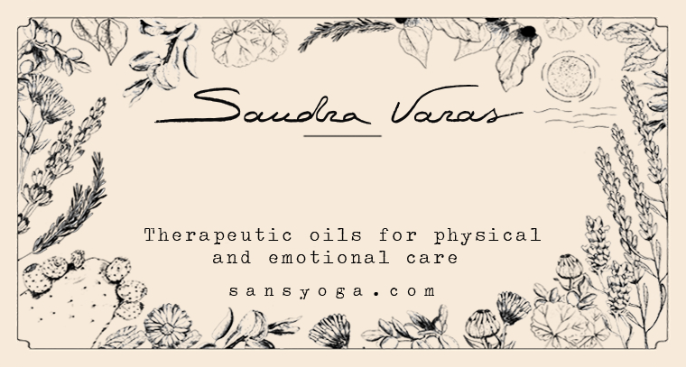
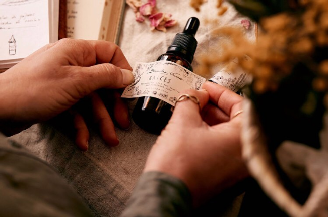
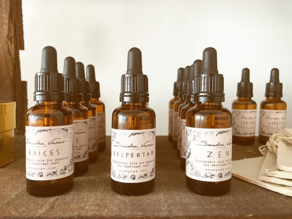
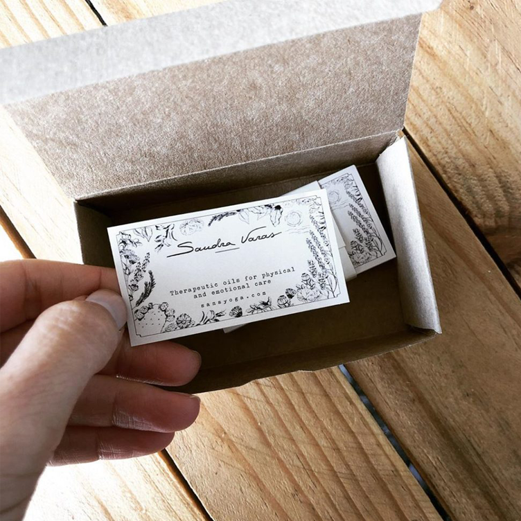
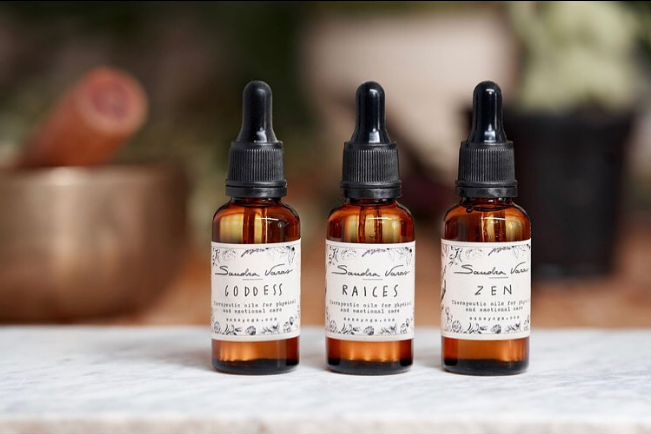
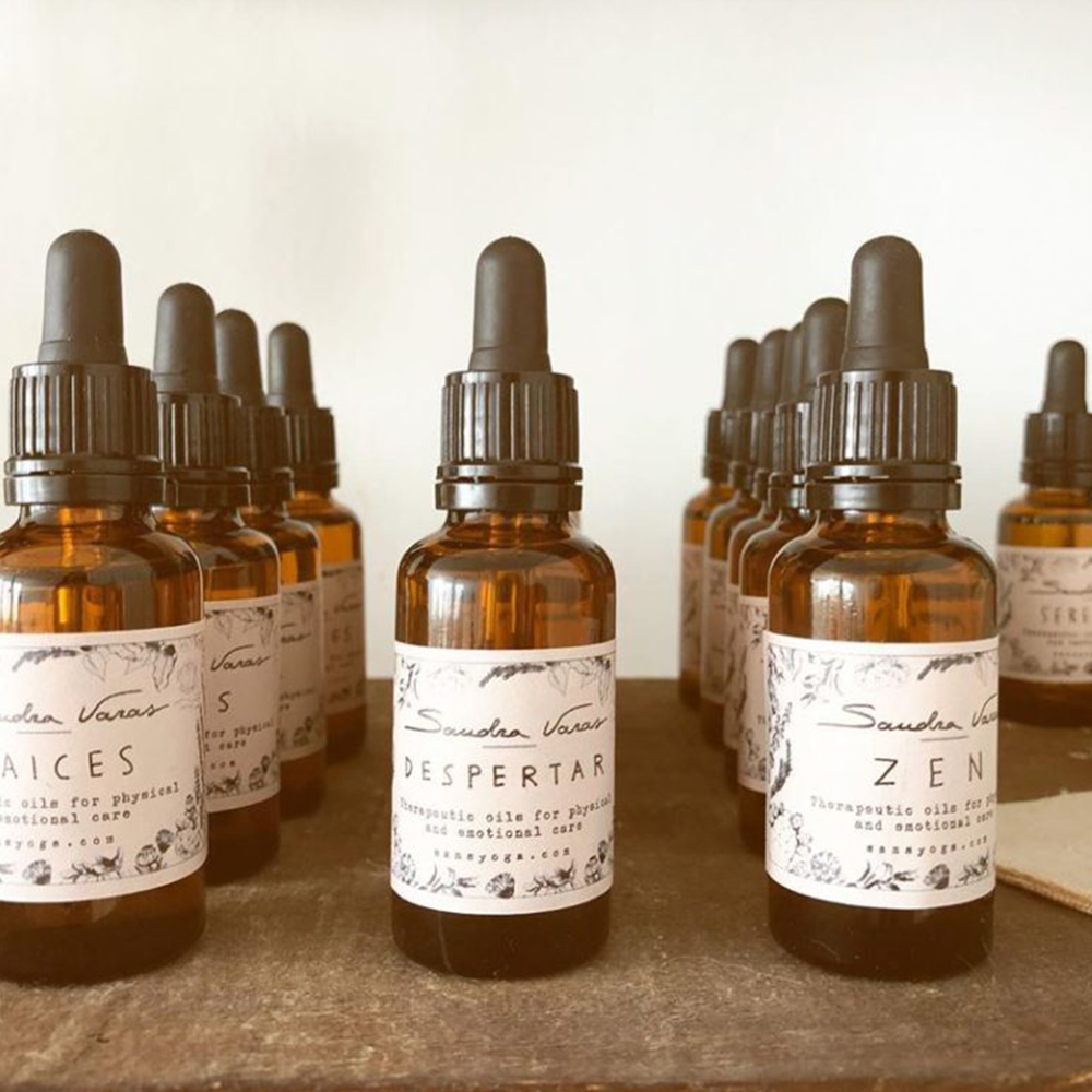
Creating the logo and the labels for Sandra Varas’ therapeutic oils was a great pleasure. Sandra prepares all her therapeutic oils herself in a traditional way, with much care and knowledge. They work at an energetic level and are aimed mainly at women.
Sandra wanted the label for her therapeutic oils to have a vintage aesthetics, complementing the type of container she had chosen for them, and evoking those beautiful little bottles in old herbal and chemist’s shops.
For her logo, we created a tailor-made hand draw typography. The idea was it to be clean and elegant.
If you want to see some more branding & packaging projects, you can do it here.
